Product Vision
We want to make our platform user-friendly for everyone. Our goal is to help users easily discover and enjoy all the features we offer, whether they're usual or prime.
We'll also make sure our platform loads quickly, so users don't have to wait. Ultimately, we aim to be a trusted place where people find valuable information effortlessly.
Role
In my role as a Senior Designer at The Economic Times, my objective was to improve the experience of discovering paid features for our valued ET Prime Users.
Project Type
App Design

Research Insights
The observations were derived from Primary Research conducted by the research team in form of online user interviews and the reason for Primary research was because we wanted a first hand insight around the behaviours and patterns of the users while interacting with the app.
Category 1
Category 2
Category 3
Absence of Personalization

Prime User Persona
Name: Prahalad Krishnamurthy
Age: 35
Occupation: Chief Business officer
Income: ₹96,00,000 per year
Education: Master's degree in Business Administration
Family Status: Married with two children, aged 6 and 8
Personality: Organised, detail-oriented, busy, and goal-driven
Bio
Prahald is a busy marketing director who is constantly on the go. He has a demanding job that requires her to stay informed about the latest business news and trends. He values his time and is always looking for ways to be more productive and efficient.
He is married with two children, and balances his work and family life by being highly organised and detail-oriented. He sets goals for himself and works hard to achieve them. Despite his busy schedule, he makes time for his family and is involved in his children's activities.
Prahald has a Master's degree in Business Administration and is highly educated. He has a high income of ₹96,00,000 per year and is financially comfortable. He is always looking for ways to grow his knowledge and improve his skills.
Why he subscribes to ET:
Prahald's subscription to The Economic Times is driven by his desire to stay informed about current business news and trends.
He sees it as a means to advance his career.
Values the publication for its high-quality journalism and comprehensive coverage.
Appreciates the well-researched and thought-provoking nature of the articles.
Considers the insights into the business world provided by the publication to be valuable.
What he Values in ET:
Prahald highly values The Economic Times for its high-quality journalism and in-depth coverage.
He appreciates the meticulous attention to detail and thorough research evident in each article.
The insights into the business world are of significant value to him.
He finds the information from ET valuable in both personal and professional aspects of his life.
How he uses ET:
Prahald is a daily user of The Economic Times.
He alternates between the print and digital editions, using his tablet or computer.
Typically begins his day by reading the latest news and articles.
Uses the information he gathers for work-related discussions with colleagues.
Enjoys sharing articles with his network of colleagues and friends.
Engages with The Economic Times for both personal and professional purposes.
Stage
User activities
User goals
Touchpoints
Experience
Problem Spaces
Awareness
Onboarding
Content discovery
Engagement
Subscription benifits
Recurring memory from the first time signup
Informed over E-mail, whatsapp and other external notifications
To avail the benefits by easily identifying them later in the product.
Push notifications
Emailers
Whats app messages
Social media posts
Multi channel nudge
Load time of the homepage
Lack of Guided tour of the core areas of the page
Quick feature discovery
Recognised the feature but failed to discover later
No map or guide for next feature after one feature is discovered.
Users fails to discover the benefits as a returning user.
Application loading
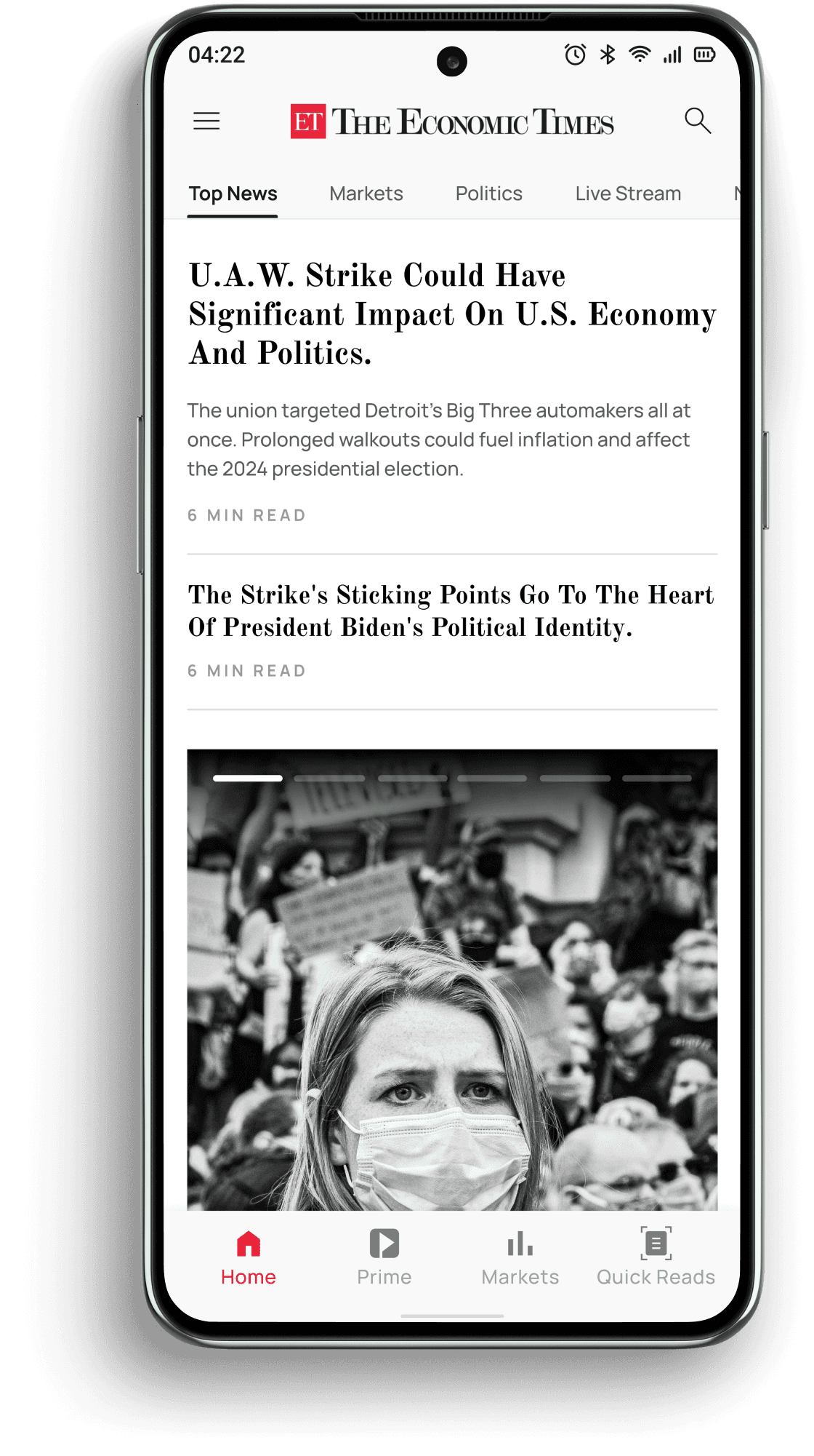
Homepage
Homepage
ET Prime Newsletters
Notifications
ET Prime Tab
Markets
Wealth
Stocks
Homepage
Homepage
Today’s paper(above Navigation)
Markets
Stocks reports
Get familiar with the entire architecture of the design and product.
Figure out where the subscriber only content are placed in the cluster of articles.
Have a smooth reading experience while on the page.
Have as less of interventions as possible for the user.
Recognise it the next time he comes on the platform
The platform should help me signify the placement of the benefits.
Comes over the platform after all the external nudges.
Tries to find out the exact placement of the mentioned benefits and look for the placement of those.
Gets engaged by reading, commenting and sharing the articles that he finds value in.
As he continues to use ET he begins to acknowledge the benefits of his subscription, including in-depth analysis and coverage, personalised experiences, and cumbersome access to high-quality information.
😀
😀
😀
😐
🙂
😕
😕
😕
😍
😓
5 Stages · 7 Characteristics ananlysed
Current User Journey
In order to understand the current flow of feature discovery and the frictions involved I mapped out the User Journey of the above persona, capturing essential factors such as where does the most of the features are discovered and how can I improve the experience on top of it.
Pain Points
08. Figuring out the pain points from the user flow
Multi-Channel Nudge:
Lack of consistent guidance across various channels, leading to confusion.
Users not receiving timely nudges to discover and engage with essential features.
Load Time of the Homepage:
Slow loading times hinder the user experience, causing frustration.
Users might abandon the platform due to lengthy load times.
Guided Tour of Core Areas:
Absence of guided tours makes it challenging for users to navigate the core areas.
New users struggle to understand the platform's layout and functionality.
Quick Feature Discovery:
Users find it difficult to quickly discover and understand the value of premium features.
Slow feature discovery may lead to underutilisation of paid subscription benefits.
Recognised But Failed to Discover Later:
Users may initially recognise premium features but struggle to locate them later, resulting in frustration.
This inconsistency in feature discoverability impacts user satisfaction.
No Map or Guide for Next Feature:
Users lack a clear roadmap or guide for discovering features sequentially, making it challenging to explore the platform comprehensively.
Users Fail to Discover Benefits as Returning Users:
Returning users may not fully grasp the platform's benefits, affecting their engagement and retention.
A lack of continuous value discovery may lead to users disengaging from the platform.

Note: Moving to solutioning of the problem we can identify and prioritise the feature we would straight up solve for. Plotting a graph as per the frequency of benefit usage and the difficulty in the discovery of the same.
List of features:
Today’s Paper
Prime Stories
In depth 40+ stock reports
Newsletters
Gifting
Livestreams
Note:
The features mentioned are solely the paid features for the users and solves for their discovery.
The prioritisation of the solution would go as per the highly used features and the respective friction caused by the user in their journey.
High Friction
High Frequency
40+ Stock reports
Prime Stories
Today’s Paper
Low Friction
Low Frequency
Gifting
Low Friction
High Frequency
Newspaper
High Friction
Low Frequency
Live Stream
Post survey and validation with the existing data, we have a clear problem to solve i.e.
Solve for how can we help users to discover prime stories, today’s paper faster with least time spent on identifying the correct positioning of the nudges
User Goals
Seamless discovery: In a page full of content Prahlad wants to seamlessly discover the prime benefits included in his subscription.
External and internal consistency: Prahlad also wants a uniformity of consistency between what he has been communicated and the final delivery of content.
Suitable identification of Benefits: Prahlad is curious and eager to learn, and want to learn extensively about the benefits that he has got and how can he identify those within the product ecosystem.
By now, that we already know that a user is unable to discover the benefits that they paid for, We might use the nudge theory and use one of the heuristics of “Recognition over Recall” to help the features get discovered.
Using Nudge Theory we marked the suitable interventions for the triggers that would lead a user recognise the benefits and utilise them
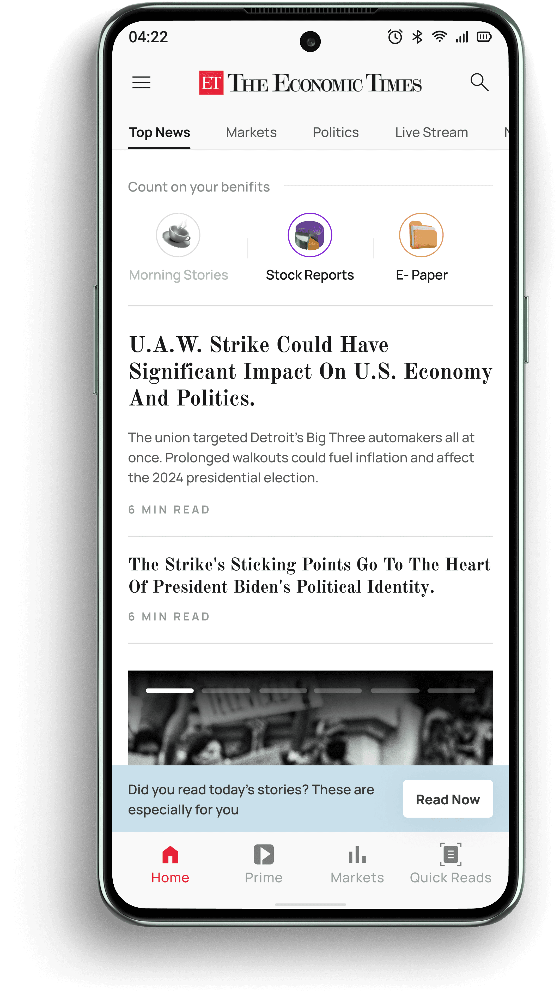
Home page
ET Prime tab
Profile
Tags with tabs
Wealth
Industry
In app notifications
Navigation
Proposed Solution
Multi-Channel Nudge:
S1
Have Internal Nudges instead of external Nudges, using nudge theory and place them strategically where most of the content is discovered.
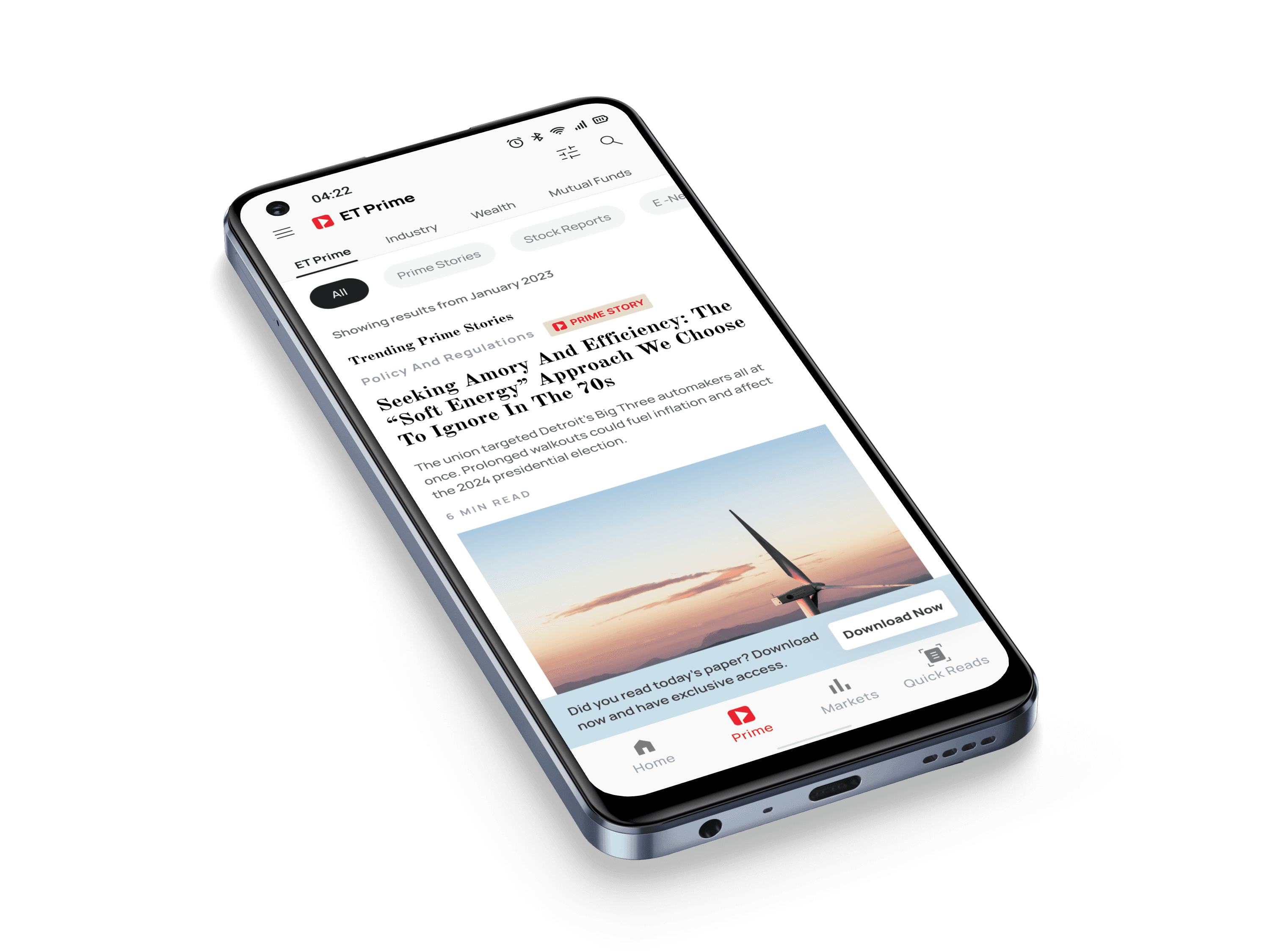
Guided Tour of Core Areas:
S2
While we understood, pushing the solution at once could be overwhelming for the users, We went ahead and used coach marks as soon as the user lands on the page
Quick Feature Discovery:
S3
In the previous solutions we discovered that the benefits were lost in the existing articles, so we used signifiers which acted as immediate signifiers for the stories.
Recognised But Failed to Discover Later:
S4
Usage of Signifiers would always create strong affordance and bring the attention to the user that they are reading the story which is for prime users. Apart from that we also have introduced better navigation in form of pills which will help to quickly navigate between the various features.
No Map or Guide for Next Feature:
S5
As we understood how did content discovery happened we have strategically placed nudges at points where users lands first and used progressive disclose to help them discover the next set of features.
Users Fail to Discover Benefits as Returning Users:
S6
With better navigation on the Prime Page we would mitigate the problem of users having a hard time figuring out the features that they paid for.

Final Designs
Based on the previously discussed strategy and rounds of itireations, We considered how to express ET’s heritage through Design. We drew inspiration from the product’s existing design language and moved ahead with teh final Visual Design. During the course of which we also introduced some new components and the principles we followed were Scalability, Legibility and Use of Lines.
→
S2
Based on our research and iteration we prioritised and structured the main features in the first fold itself, considering the User’s behaviour of reading the news everyday and because they know the information structure so well that they understood the the stories were newly added. This would help users to recall the features they were promised while buying the subscription.

The Economic Times

03. Consistency
We ensured a great User Experience by enhancing the app through consistent components, actions and behaviours, creating an intuitive interaction flow that fosters familiarity and efficiency for users.
01. Usability
We created a seamless experience by employing familiar interaction patterns, and conducting rigorous usability testing, to validate and enhance the app’s user satisfaction.
02. Navigation
We optimised the ap navigation by designing a clear and streamlined information architecture, ensuring efficient user journeys by prioritising key features, and creating a simple navigation flow that reduces cognitive load, leading to effortless user interactions.
04. Accessibility
We designed the app with accessibility in mind to ensure inclusivity, allowing all users to effortlessly navigate and interact with the app, regardless of their situation and particular condition.
Improvements

S4, S3, S5
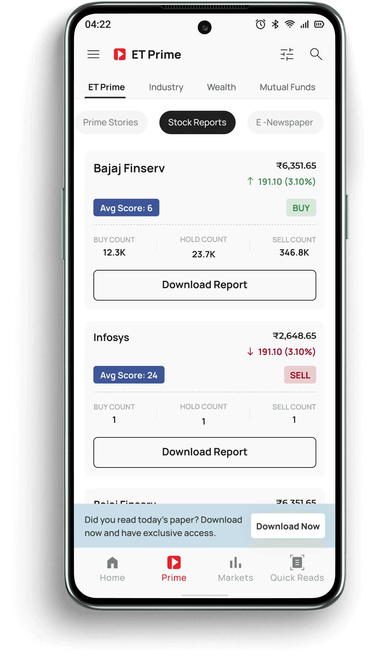
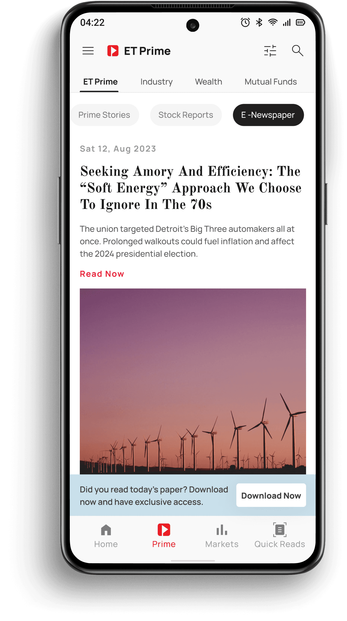
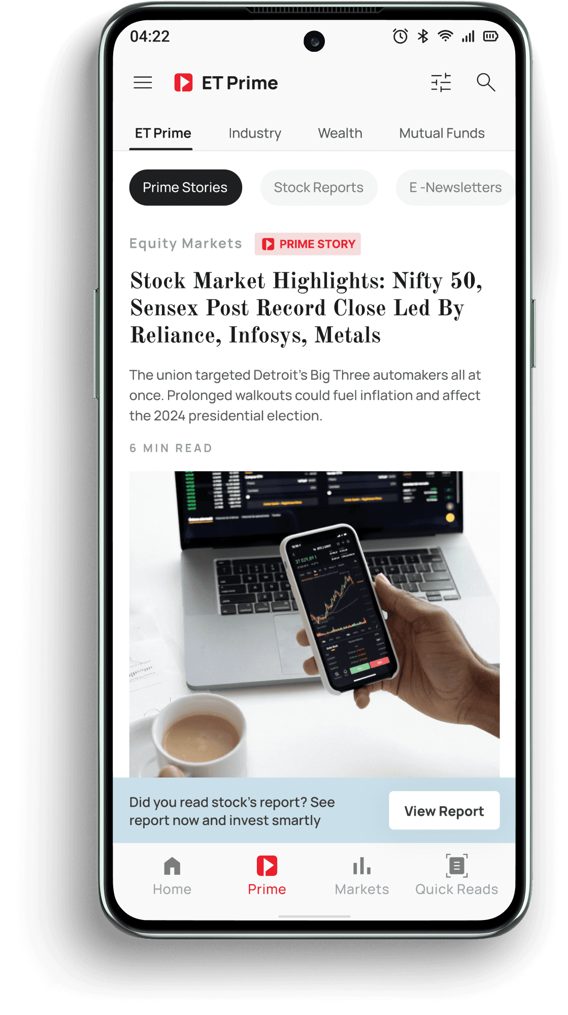
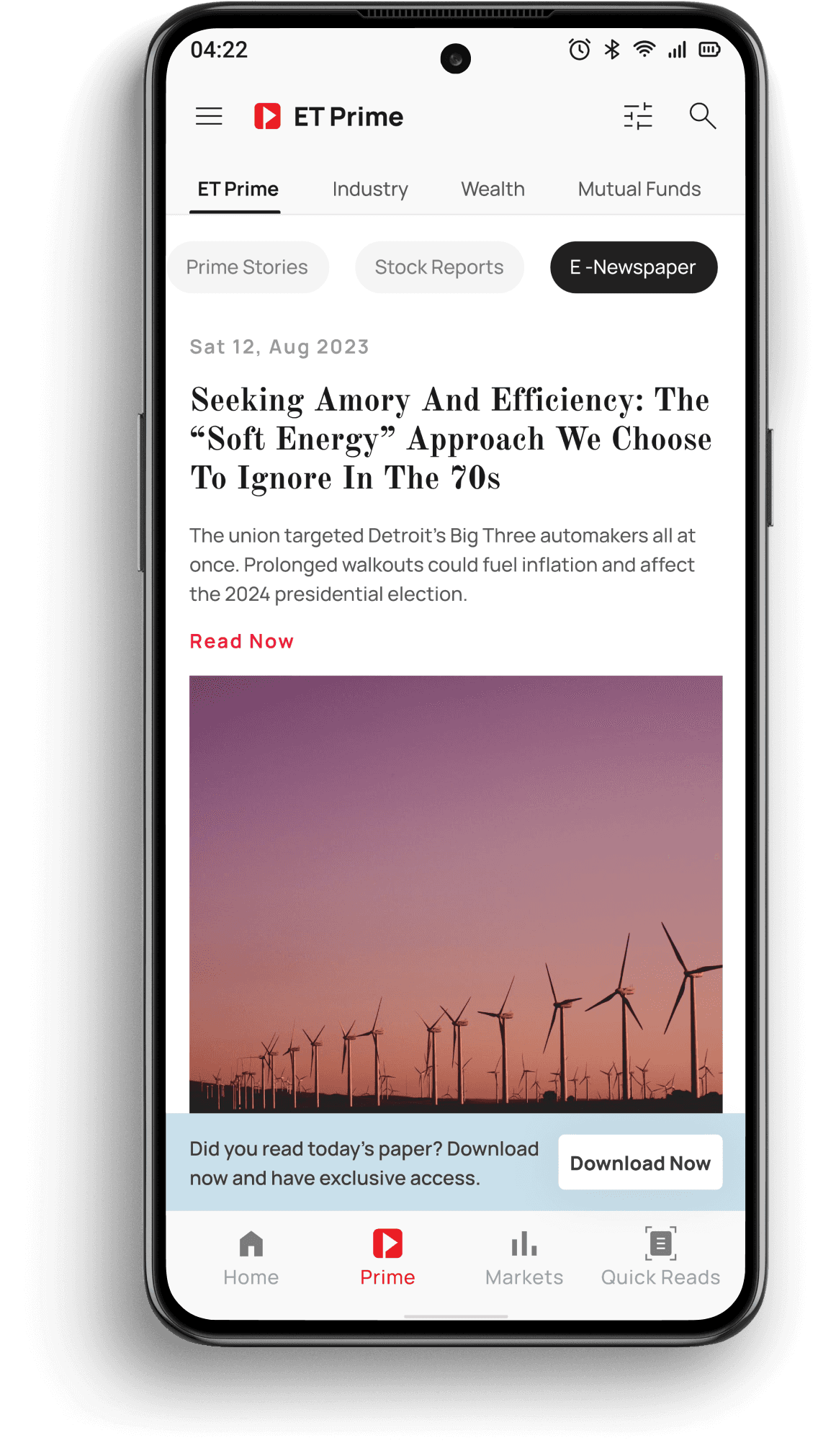
40+ Stock Reports and E-Newspapers
Accessing stock reports was never this easy, Users can now individually download the reports unlike before and with E-newspaper which used to come over as newsletters now could be read inside the app itself.
S5, S6
Increase in Feature affordability
By enabling a User to read the newspaper in the app itself created a significant value for the users where they were no more required to leave the platform and consume the promised content on the app itself.
S1, S3, S6
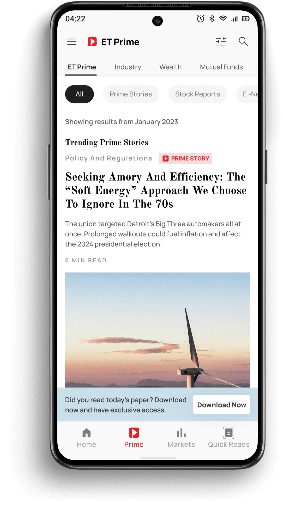
Pills & Internal Triggers
Once a user enters the ET Prime Section hey can easily switch between the various benefits they were subscribed to such as Prime Stories, Stock Reports & E- Newspapers.
S3, S4
Signifiers
Using Signifiers in the immediate proximity of an article expressing that it is the promised benefit of the subscrition.


S1, S3, S5
Internal Triggers
Since we’re changing the users behaviour of reading E-Newspaper, we went ahead and added internal nudges smartly at points where a user would be triggered the most to try the feature.
In this case after reading the Stock reports we want the user to read the E-Newspaper that way we will increase the adoption of the feature and improve the product metric.


all screens


Metrics to capture the design impact
These business and design metrics collectively provide a comprehensive assessment of the impact of design changes on user’s behaviour & the overall success of the platform.
Feature Adoption Rate
Time to discover features
User Satisfaction Rate
Task Success Rate
Engagement Metrics
⬆ 28%
of the prime users renewed their subscription
being a significant raise from the previous month’s numbers.
30
20
15
10
5
0
- Retention of prime User
- Increase in new subscription
Impact of Design on the Business
With recent data we saw that the response from users was endearing and happening. The retention rate went up by 28% which was 8% north of what we expected by the 1st release.